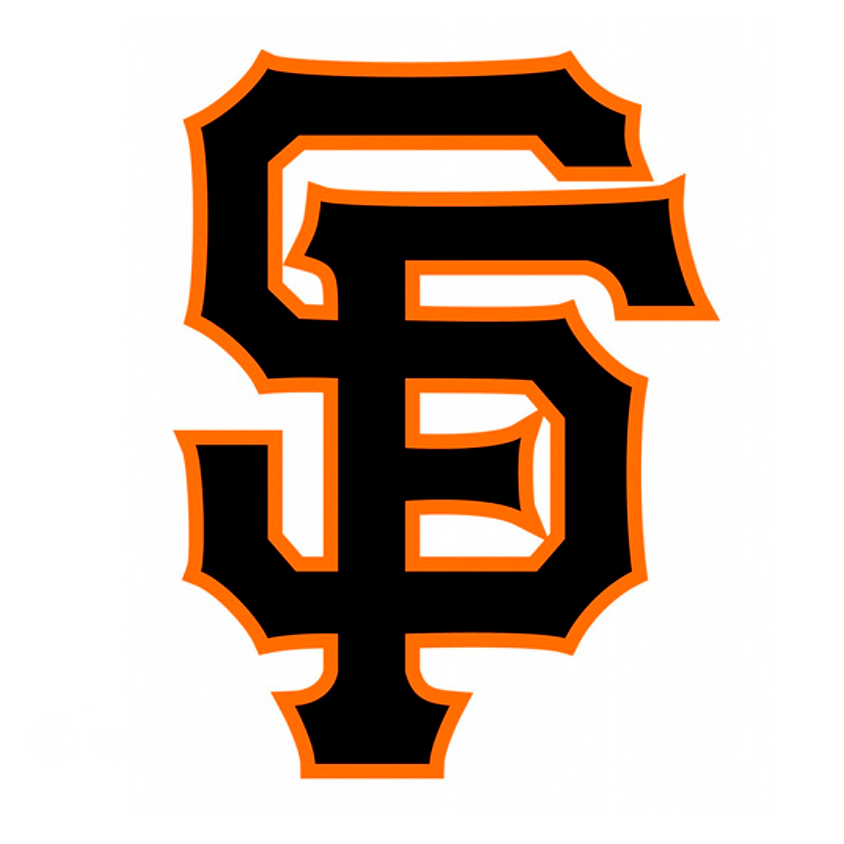
Former New York caps utilized a (incomparable) monogram utilizing a style from "left field" but our challenge for the redesign was the coordination of the monogram with the type style used on the jersey logotype...
Yes, inspired by a blurry photo provided by the SF Giants organization, I drew these letters in tight pencil and they were "inked" by the ever so exacting executioner, Jock Campbell at SBG Partners to debut in 1994 (as did our talented illustrator daughter, Alex Campbell, who asks the legitimate question, "if you designed that logo, how come we're not rich?").
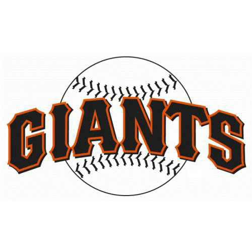
The signature home uni, considered one of the best in baseball
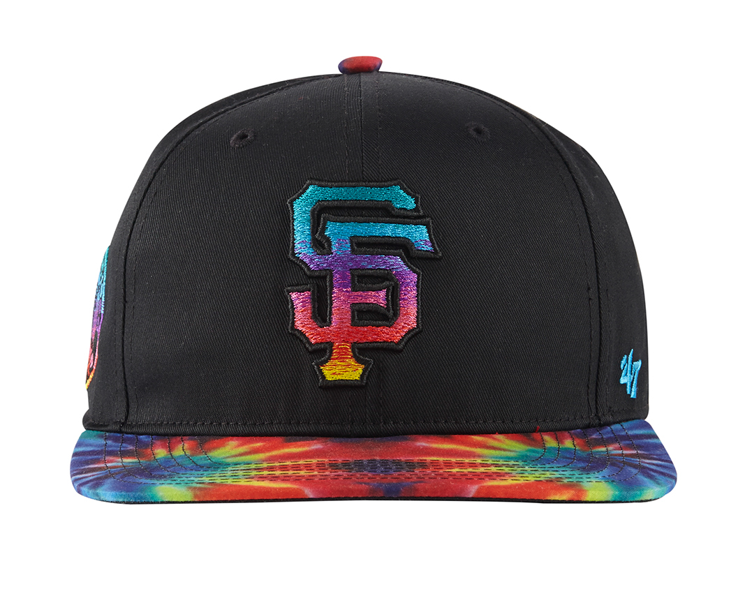
Available in every color in the rainbow city plus tie dye, and, I'm sorry to say, camo.